For my poster I felt as if the font of the text should be consistent with that in the trailer and the magazine cover. In doing this there creates every link between the products and this also keeps fluidity. The font that we used during the trailer and magazine, which would be used in my poster was TRIJAN PRO. This text would be used throughout the poster, however different sizes would be used for different sections and some in bold. I also wanted the film title to be in the same font and but ti have effects added to make it stand out more. Here are the different effects I created and the final one I chose to use:
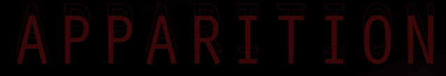 |
| effect 1 |
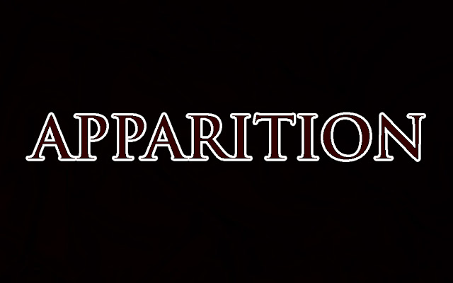 |
| effect 2 |
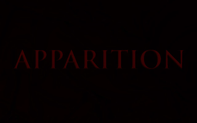 |
| effect 3 |
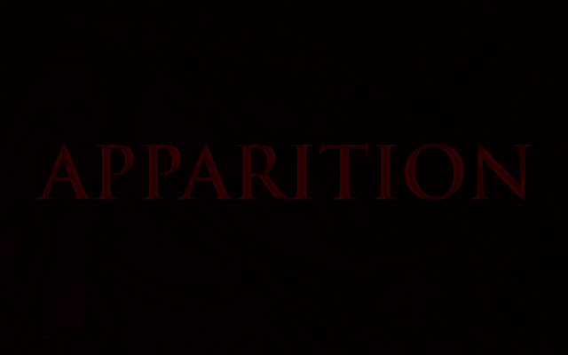 |
| effect 4 |
The final effect that I chose to use was effect 1. I chose this because I felt as if the others were too fussy to have on my poster and would distract too much, where as the first effect was simple but effective.


