Picture Selection:
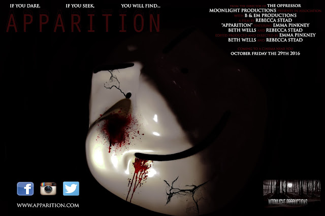
For my poster I wanted to use the mask that is worn by our villain to be the focus and the only focus. I decided to take a range of pictures of the mask against a black cloth, some with flash and some without. After taking over 30 pictures I have narrowed it down to just 2. One which shall be my poster and the other my magazine cover.
The reason I made this decision was because I liked the different angle instead of it being just head on to the camera and the natural light that splits down the centre of the mask.
The final effect that I chose to use was effect 1. I chose this because I felt as if the others were too fussy to have on my poster and would distract too much, where as the first effect was simple but effective.
Fonts:
For my poster I felt as if the font of the text should be consistent with that in the trailer and the magazine cover. In doing this there creates every link between the products and this also keeps fluidity. The font that we used during the trailer and magazine, which would be used in my poster was TRIJAN PRO. This text would be used throughout the poster, however different sizes would be used for different sections and some in bold. I also wanted the film title to be in the same font and but ti have effects added to make it stand out more. Here are the different effects I created and the final one I chose to use: |
| effect 1 |
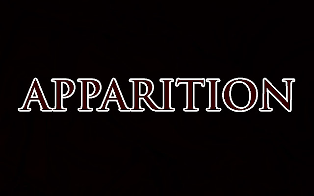 |
| effect 2 |
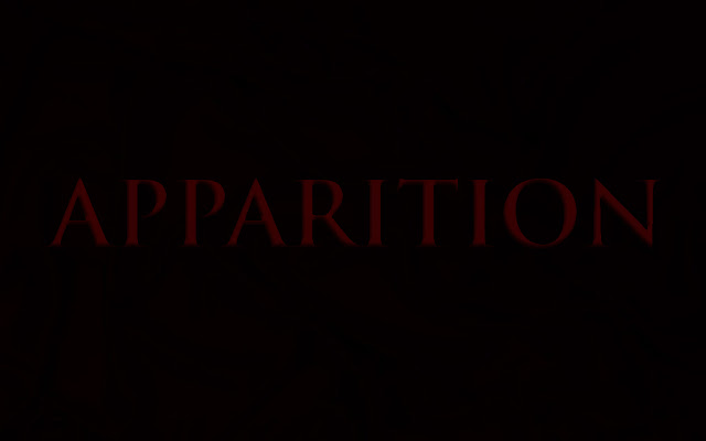 |
| effect 3 |
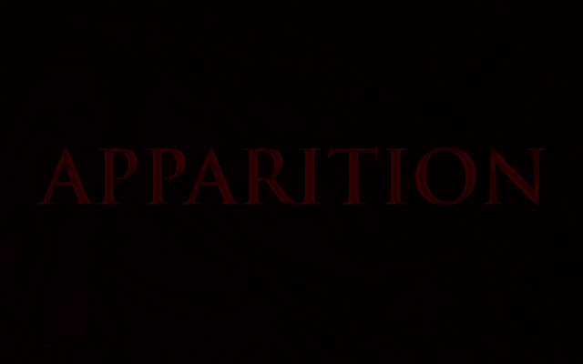 |
| effect 4 |
Layout ideas:
I once again looked through my different layout choices and concluded that for my poster the best choice to use would be layout 3. I wanted the entire poster to be my picture and the writing to be around the focus of this, making this layout the best choice.
Release date:
We had decided that our trailer needed to be released around the time of halloween as it seemed to fit nicely with the iconography of halloween being scary. With the next upcoming halloween date falling on a Monday, it seemed appropriate for the film date to be on Saturday before, allowing as many people as possible to watch the film over the weekend. The date was therefore selected to be Saturday 29th October.
Billing Credits:
Billing is a film term denoting the amount and order in which film credits information is presented in advertising and on the film itself. Information given in billing usually consists of the actors appearing in the movie, the directors, producers, the companies producing and distributing the movie (by name and or/logo), and artistic and technical crew. The title of the movie is also considered to be part of the billing.
In the layout of film posters and other advertising copy, the billing is usually placed at the bottom of the poster in what is known as the billing block.
I kept this information in mind when creating my billing block that would be placed in the top right hand corner of my poster, with this being the final outcome:
Picture transformation:
I wanted to keep my poster quite simple, therefore deciding to keep the background black and focus on the mask in order to create an effect. I decided to darken the masks black areas and brighten the light that covered half of its face. I then decided to create crack marks within the mask and add blood onto it as well. I did this as i wanted to show that the mask has some sort of human features about it and by adding the cracks and blood it shows that there is a possibility the creature could be defeated.
Here is the image before and after:
 |
| Before |
Photoshop process:
You can see in the image the transformation of my image. You will now be able to see the entire process from the beginning of my poster to the final product.
The first thing I decided to do was to brighten the image and contrast it. This made the light brighter and the background appear darker. The next thing I decided was to add cracks to the mask to give it a worn look and appear that it is not completely invincible.
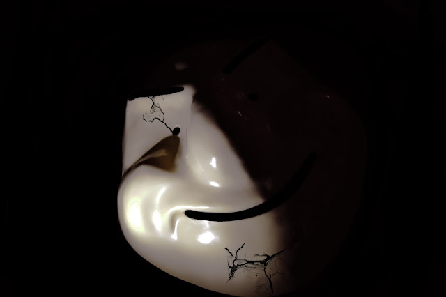 |
| Step 1 |
 |
| Step 2 |
 |
| Step 3 |
 |
| Step 4 |
 |
| Step 5 |
The final step was to add star ratings for my film. When asked, I was told to use THE TIMES and THE GUARDIAN which are popular newspapers to rate films. I then gave my film 5 ratings by each of the companies as this catches the audiences attention by the impressive stars. Once I had done this I had completed my product which can be seen below:
First draft:
"The poster looks really good and I do not think any thing really needs changing on it. Just double check everything lines up neatly."
"Don't forget to add your other groups members production company so that you have both of them on there."
"Make sure you all have the same release date for your film or simply have coming soon on there instead."
"If you market the mask, like I suggested when discussing your trailer, this should make this even more effective."


