
Photoshop Process
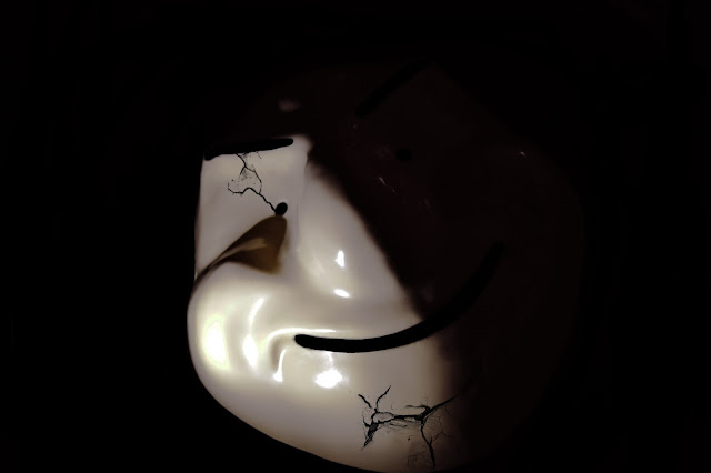
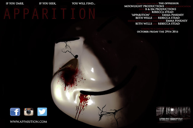
You can see in the image the transformation of my image. You will now be able to see the entire process from the beginning of my poster to the final product.
The first thing I decided to do was to brighten the image and contrast it. This made the light brighter and the background appear darker. The next thing I decided was to add cracks to the mask to give it a worn look and appear that it is not completely invincible.
 |
| Step 1 |
 |
| Step 2 |
 |
| Step 3 |
 |
| Step 4 |
 |
| Step 5 |
The final step was to add star ratings for my film. When asked, I was told to use THE TIMES and THE GUARDIAN which are popular newspapers to rate films. I then gave my film 5 ratings by each of the companies as this catches the audiences attention by the impressive stars.
Picture Transformation
I wanted to keep my poster quite simple, therefore deciding to keep the background black and focus on the mask in order to create an effect. I decided to darken the masks black areas and brighten the light that covered half of its face. I then decided to create crack marks within the mask and add blood onto it as well. I did this as i wanted to show that the mask has some sort of human features about it and by adding the cracks and blood it shows that there is a possibility the creature could be defeated.
Here is the image before and after:
 |
| Before |
Layout Ideas
I once again looked through my different layout choices and concluded that for my poster the best choice to use would be layout 3. I wanted the entire poster to be my picture and the writing to be around the focus of this, making this layout the best choice.
Fonts
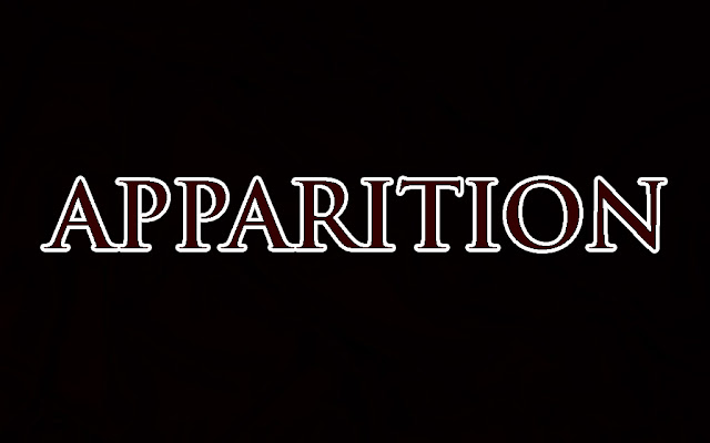
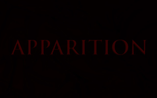
For my poster I felt as if the font of the text should be consistent with that in the trailer and the magazine cover. In doing this there creates every link between the products and this also keeps fluidity. The font that we used during the trailer and magazine, which would be used in my poster was TRIJAN PRO. This text would be used throughout the poster, however different sizes would be used for different sections and some in bold. I also wanted the film title to be in the same font and but ti have effects added to make it stand out more. Here are the different effects I created and the final one I chose to use:
The final effect that I chose to use was effect 1. I chose this because I felt as if the others were too fussy to have on my poster and would distract too much, where as the first effect was simple but effective.
 |
| effect 1 |
 |
| effect 2 |
 |
| effect 3 |
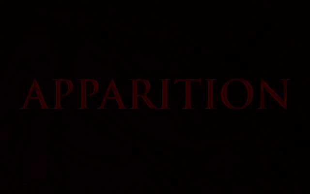 |
| effect 4 |
Picture Selection
For my poster I wanted to use the mask that is worn by our villain to be the focus and the only focus. I decided to take a range of pictures of the mask against a black cloth, some with flash and some without. After taking over 30 pictures I have narrowed it down to just 2. One which shall be my poster and the other my magazine cover.
The reason I made this decision was because I liked the different angle instead of it being just head on to the camera and the natural light that splits down the centre of the mask.
Photoshop Process
I started by adding the image I wanted to use onto a black background and adding the effects to the mask in the same way I had done for my poster. During this process I had to remove the logo that was on the jumper and remove the red patches that were on the belt.
 |
| Step 1 |
 |
| Step 2 |
 |
| Step 3 |
 |
| Step 4 |
 |
| Step 5 |
 |
| Step 6 |
 |
| Step 7 |
 |
| Step 8 |
Fonts
For the masthead of my magazine I wanted the font to be very bold and eye catching. I flicked through multiple fonts and managed to condense it down to three fonts that I believed could possible work. I then decided to test them out with my magazine name and these were the results:
Once I had decided that I wanted to use ROCKWELL EXTRA BOLD. I thought of ways that I could make it stand out even more. I decided that I wanted it to be two colours as if there is a border of one colour around it. I also then decided to add an effect and chose to add cracks into the text to resemble the cracks on the mask of my protagonist. This was the outcome:
I added cracks to the letters that will be seen on the cover but half of the E and the P will be covered by my image which is why only sections of them letters have had the effect added to them.
For the main text on the magazine cover I wanted it to bet the same that is included in the trailer and the poster. This would once again make the connection between the film and the magazine and also make my products look as if they have fluidity. The text that was used was TRAJAN PRO throughout the magazine, the only differences throughout were the sizes of the text used for different sections as well as some of it being in bold.
Name Ideas
These were the names that I came up with to use for my film magazine. I was unsure from the 12 which to use or even which to get rid of and condense it down. I therefore decided to ask my Media teacher to circle the few in which he believed would be a good choice.
These were the three names that he circled. SILVER SCREEN, HYPE, CINEMATIC. I kept all of the three names in mind for when I started to create my product, however quickly concluded that I wanted the magazine name to be quite short and catchy meaning my decision for the name of the magazine was decided as HYPE.
Sound
Although our trailer does include speech, we still feel the need to include music through out the video even if it just to be in the background. None of our group has any skills developing music and we therefore decided to use soundtracks of a horror genre that has been created and shared onto YouTube. We asked permission from the creators of the soundtrack if we could use it as part of our trailer to which they agreed. We selected a range of soundtrack and listened to all to see which would fit the best and whether we would maybe need more than one.
Once looking through these different sounds we found that we needed more than one soundtrack and decided on the following:
Choosing a Font
To help me decide on the best font to use for our title and tag lines I decided to assist the help of a website, www.dafont.com. This website gave a massive range of different fonts that could be used for a horror genre. After flicking through hundreds I condensed it down to 5 different fonts to choose from. I used the title of our film in the variety of fonts to see which would fit the best and here are the different fonts:
We concluded that the font we are going to use was called TRAJAN PRO. I believed this to fit in very well within the trailer as it was not too complicated but still caught your eye. It also worked very well against the static background we chose to be behind the text in the trailer.
 |
| Accord SF |
 |
| Castellar |
 |
| Segoe script |
 |
| Tennessee heavy SF |
 |
| Trajan pro |
We concluded that the font we are going to use was called TRAJAN PRO. I believed this to fit in very well within the trailer as it was not too complicated but still caught your eye. It also worked very well against the static background we chose to be behind the text in the trailer.
Subscribe to:
Comments (Atom)


