Inspiration from Existing Posters
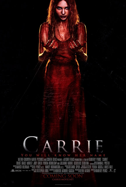
- The use of the colour red indicates the genre of horror as it is a common convention usually linked to blood and gore leading to death. The colour red is also linked to danger
- The image of a woman on the poster gives the audience an idea of who to look out for in the film
- The dark lighting and black background links to the darkness there will be in the film and gives the audience pre-fear
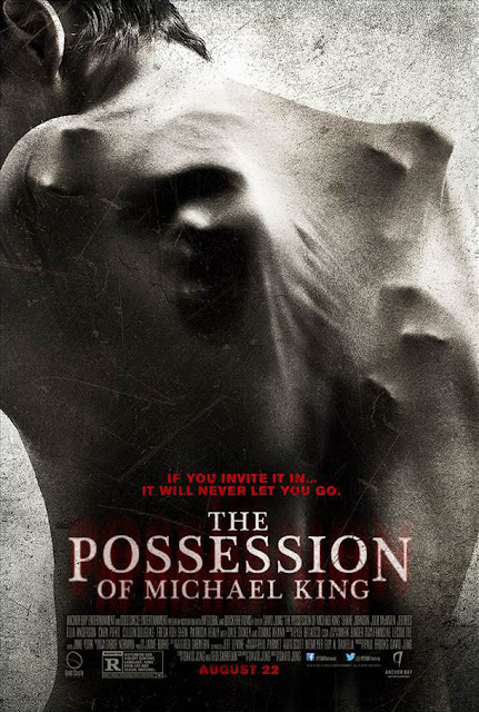
- the grey pale colours gives off a cold feeling towards the audience
- we cannot see the faces of anything in the poster, this is the sense of unknown which is unnerving and mysterious

- the single house in the centre shows isolation, linking to fear of being alone
- blurred sections of the poster and fog creates an eerie atmosphere with a sense of mystery
- the black and white leaves you feeling empty and unsure due to blankness and once again mystery
- scary prop of the boarded up windows could be based around the story line of isolation and unknown
- comments on the movie and a 5 star rating will make audiences eager to go and see the film
- picture in the poster and the title link together giving the audience a clear idea of the film
- the off black and white colours gives the poster an eerie feel as it looks old and unwanted
- close up of the actors face tells the audience who to look for- the emotion on the face is also portrayed onto the audience from the beginning
- the title of the film takes over a significant amount of the poster allowing it to stand out
- the mist in the poster adds tense atmosphere and mystery


